WordPress web design trends are constantly changing for the better, and there are always some WordPress website design trends that you may have seen on famous popular WordPress websites or know about by reading online. Nowadays, if you own a WordPress website design company, you have to follow specific web design trends to stay in business and don’t lose to your competition.
Most WordPress website design trends are eye-catching and user-friendly. Due to the flexibility of WordPress and its source code, you can implement many changes and designs to a WordPress website at any given time. However, in this article, we would like to discuss 20 WordPress website design trends of 2021.
20 WordPress Website Design Trends
As mentioned above, WordPress is very flexible, and you can add or remove features to it by installing official or third-party plugins. A website designer typically uses Adobe PhotoShop or XD to come up with a gorgeous design for a soon-to-be WordPress theme. But, the created project needs programming so that it can be a theme.
As a designer or a WordPress website design company, you can use some plugins that you can use on a client’s website to implement changes or redesign their website. Nowadays, page builders have eliminated the need to have a full-time team of developers and designers at any company. As a web designer, you can take advantage of the tools found in the WordPress repository.
Elementor is the most popular page builder in WordPress, and it currently has over 5 million active users. The plugin comes with a few extra extensions and plugins that allow you to design any website that the Elementor page builder is installed on.
Sliders. WordPress sliders such as Smart Slider 3 or Revolution Slider can transform your website. You can create gorgeous-looking sliders with a call-to-action button that could potentially convert visitors into potential customers on any website.
But what are the WordPress website design trends that you should consider adding to either your or a client’s website?
1. Page Builders
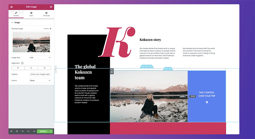
Due to the success of the powerful Gutenberg editor that WordPress introduced, many WordPress users turned into using page builders such as Gutenberg that are block-based, and using them doesn’t require any programming knowledge as everything is visual. You can see the changes as you are making them.
The closest competition to WordPress’s Gutenberg editor is Elementor, Visual Composer, and Beaver Builder. These drag and drop page builders are much like Gutenberg but offer a lot more options and flexibility to users. More specifically, many designers and developers have been using Elementor to design a WordPress theme and proceed to sell it on third-party websites.
2. Virtual Reality and Augmented Reality
With the help of Virtual Reality and Augmented Reality, you can offer users a brand new experience that they have never seen on any other websites before. Augmented Reality, or AR for short, revolutionized the eCommerce industry. It gives potential customers better insights into the product’s appearance. For example, Jeep has been using AR to provide a better experience to their users online. You can view inside of their vehicle, add or remove options and see how they would look in the car.
There are AR WordPress plugins that you can install and activate on your website. On the other hand, Virtual Reality is often used in the Real-estate and tourism industry as it would help clients look at the house thoroughly before making a trip to the property and view the place in person.
3. Video Background
Having a video background has always been a trend in website design. However, it has gained a lot of popularity in recent years because it can grab visitors’ attention and reduce the bounce rate. However, some designers believe that having a video background can increase the loading time of a website and since a lot of people care about the loading speed of a website having a video background is pointless.
But having an optimized video background can leave a great first impression, and it can be used to give out more information and the type of information you can’t express in words and prefer visitors to see it for themselves in a video. If you are struggling with user engagement on your WordPress website, we recommend following this trend and adding a video background to your website.
4. Minimal Design
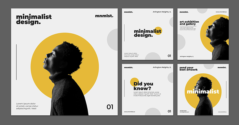
Having a minimal design is very important as fast load speed is growing. Having a minimal website design can directly affect your website’s speed and, most importantly, SEO, leading to a higher ranking in Google and similar search engines.
5. Multipurpose WordPress Themes
WordPress is the best CMS globally, and it’s currently powering 36% of websites on the internet. WordPress is being used in a variety of industries. Multipurpose themes are slowly replacing WordPress niche-based themes as they offer more demos, features, and, most importantly, cost-effectiveness. A multipurpose website can be used for all sorts of the website due to the features they offer.
6. Single Page Design
As mentioned above, a minimal WordPress website is proven to work wonders for speed and ranking high in search engines such as Google. Over the years, single-page designs have gained popularity and have been used for a variety of websites. A single-page WordPress design is perfect for highlighting important information by removing distracting features and elements of a website.
7. Chatbots
Having a chatbot or some digital assistant is favored by both small and large companies as they bring 24/7 pre-designed responses to various questions that you think users may ask. It gives the impression to the customers as if their questions are being taken care of by a real-time agent behind the chat. Chatbots have been effective as it prevents customers from staying in large queues to chat with a real person. A chatbot can handle multiple inquiries at any given time by providing instant responses.
8. White Space
We talked about minimal design above and how it can take your website and place it in a better ranking in different search engines. Having white space in your minimal design is the key to catch your visitors’ attention. By having white space, you automatically convince visitors to focus on the important information you would want them to see. As a result, it increases visitors’ engagement on your website, and it may lead to a call to action being clicked.
9. Mobile UX – Thumb Scrolling

With the rise of smartphones and the features they offer, many people have been spending more time on their smartphones and often make purchases, visit websites, etc., online with their phones. Therefore, it is crucial to have a mobile-friendly WordPress website. Younger people tend to hold their phones in one hand and use their thumbs to navigate through the website and click on icons, links, etc.
Therefore, it is crucial to design your website so your visitors can navigate through your website with one finger.
10. eCommerce Improvements
In 2020, due to the pandemic, many people had started an online business with WordPress or any other content management system. In 2020, due to the lockdowns across the world, the postal systems were struggling to keep up with the requests. As a result, in 2021, it is strongly believed a way will replace the postal system, and there will be many improvements coming to the eCommerce of WordPress. For example, digital currencies have been replacing regular payments in many eCommerce websites.
11. Broken Grid Layouts
A popular WordPress website design trend is the broken grid layout. People highly love elements that overlap with one another on the web as this type of layout can break the dullness of a website. Keep in mind; broken grid layouts aren’t meant to be used for every website. However, you can use this type of grid to create a personal-looking website.
12. Vibrant Colors

Nowadays, vibrant colors and high saturations are the key players of every website. Colors can have a significant impact on people’s emotions. Choosing the right colors for your WordPress website can determine whether your design gives visitors a good feel or makes them look the other way.
13. Illustrations
Illustrations on both header and footer can tell a great story. Using customized illustrations, you can make your WordPress website or a client’s website more personal while telling a story about what they do. However, the key to having a great illustration is to find the one that matches your brand and what you are trying to say.
14. Backgrounds
You have probably seen headings in the background before on many websites. Having headings in the background helps your visitors focus on different parts of the website and focus more on the message you are trying to get across.
15. Mobile Friendly

As mentioned above, having a mobile-friendly theme is crucial as many people use their smartphones for their day-to-day tasks or for a simple search on Google to purchase a product. Having a responsive design enables you to be amongst those websites that Google finds mobile-friendly and prefer to display them rather than displaying a website that is not mobile-friendly at all.
16. Sliders
As mentioned at the beginning of this article, having sliders can transform your website. They enable you to display the crucial messages on the homepage with a call to action. You can use sliders to highlight a product, services, etc., that you would like your visitors to see as soon as they visit your website. Sliders are very important as they are the first element that users see, and they can determine whether they stay on your website and scroll down to explore more or leave immediately.
17. Hero Image
The hero image is the large image below the header of websites. Nowadays, many websites that are following the “having a fast loading website” rule use hero images as images can be compressed and optimized for both SEO and speed. Also, you can use sliders to have multiple hero images.
18. Typography
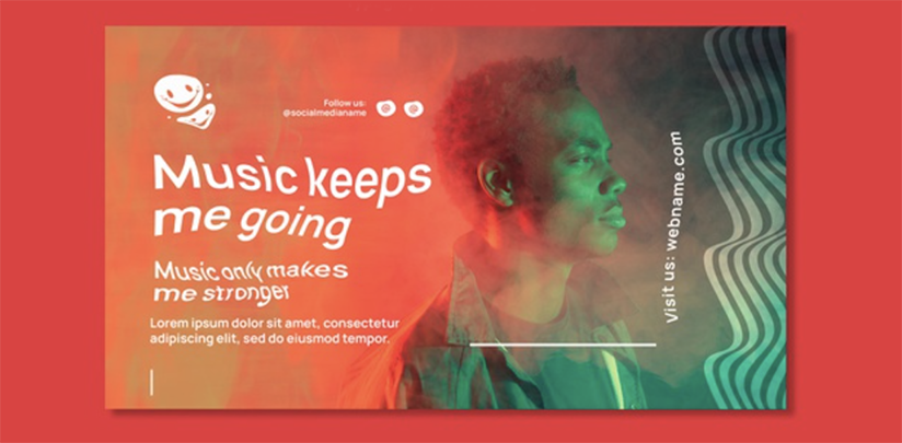
Typography is considered to be the most important design tool of a WordPress website. In web design, having creative typography can take your site to a whole new level. With the right typography, you can highlight the crucial parts of a text, add animation, etc.
19. Split Screens
Having a creative web design can make your website stand out from your competitors. The split-screen layout breaks your website and split it into two sections, and you can maximize the space of each page or section of your website. This layout is often used for real estate agencies where they would like to showcase a house and give out crucial information about the property.
20. Parallax
The parallax effect can give your website more depth. The parallax effect is mostly used in the background. Imagine having a big image in the background, and while you are scrolling down, you can see different parts of the image. Moreover, this effect can also be used on a text or any other small elements.
Conclusion
In this article, we discussed the top 20 WordPress website design trends of 2021. These are just trends that web designers or a WordPress website design company follow; it doesn’t necessarily mean that you have to follow every single one to have a highly visited website. Which of these designs are you going to implement on your WordPress website? Which one of them are you already using? Let us know in the comment section down below.
Leave a Reply