Anyone with a few technical skills can create an online site nowadays. With the various online shopping platforms available and accessible, you don’t have to know programming languages such as HTML or CSS. The majority of platforms can help you build a shopping site and allow you to enable online payments in a short time period of time after launching the website.
However, all you require is an eCommerce website design inspiration and a fundamental understanding of eCommerce website development costs. To assist you in this area, we’ve put together a list of the 21 best design eCommerce websites that you can look at and take inspiration from and even ask Rackset eCommerce design agency to design your custom ecommerce website.
Without further ado, let’s begin.
What Is an eCommerce Website? How Do They Work?
“E-commerce” is a term that refers to “electronic commerce,” which is selling and accepting payments online. The idea is often divided into groups based on the different categories and niches. To put them into simpler terms, there is the business to consumer (B2C), businesses to business (B2B), consumer to business, (C2B), consumer-to-consumer (C2C), business-to-government (B2G), and also government to business (G2B).
One of the major advantages of having an online website for your goods or services is the capability to build a larger client base. Since you’re not selling solely in a physical store, the possibility exists of selling your items worldwide. There are many other advantages of having an online store, including the following:
- All-hours-of-the-day: Your website never closes, which means potential customers are able to shop for the items they require regardless of the time.
- Lower inventory costs: A brick-and-mortar store needs to be fully stocked. When you run an online shop, it is possible to maintain your inventory at a minimum by employing a technique known as drop shipping. This means that you can ship to your customer directly from the factory.
- Additional savings in cost: An online store reduces overhead costs such as rental. Businesses that are online may also need smaller numbers of employees.
- The ability to scale: If you are starting an online-based company, you can begin with a small size and expand as you require. If you are outgrowing your brick-and-mortar shop, it could be harder to locate another store, and this could result in greater expenses.
There are a few items you’ll require when building an online store:
- The domain you choose for your site makes it easy for your customers to find you
- An SSL certificate that encrypts and protects sensitive data such as personal and credit card details
- A shopping cart where customers can purchase items easily
- A merchant services account is used to accept a variety of payment methods.
When it comes down to the best way to design an eCommerce website, you must be sure to keep your intended customers in your mind. Create a user-friendly experience that allows visitors to stay on the site and buy. Be sure your website describes what you’re offering.
If you are busy with life and work, you can ask our professional website designers on Rackset eCommerce design agency that’ll design a website per your requirements at a fee.
Types of E-commerce Platforms
If you’ve chosen to develop your own online store using an online platform, there are three major types of websites you’re likely to encounter:
- Open-source
- SaaS
- Headless commerce
It’s helpful to know, at a minimum, the benefits of each before selecting the best one for your company. We’ll discuss different types of eCommerce platforms down below:
Open source
When it comes down to eCommerce website development costs, you may face a lot of options. However, we strongly believe working with an open-source platform is the best way to go. Utilizing open-source software like WooCommerce (a WordPress plugin) and Magento is a sign that you have accessibility to their source code. It’s crucial because when you have access to the code, you are able to modify it to completely tailor the platform to suit your needs. If your company requires extensive modifications, the sky is the limit.
SaaS
SaaS is “software as services.” When you use a SaaS platform such as BigCommerce or Shopify, it is for a subscription or licensing cost. The platform is hosted by the service provider that you bought it from. This provider is accountable for its administration and the hosting as long as you wish to pay for the costs.
In contrast to open-source platforms, you’ll be unable to access source code; therefore, it’s not as customizable. Instead, you’ll be able to use templates that you can select from. But what if you don’t need to invest effort or time into customizing and maintaining the platform? In this situation, SaaS might be an ideal alternative for you.
Headless eCommerce
Headless Commerce allows you to build a storefront for your company and separate it from existing technology for e-commerce. This makes sense for websites that offer interactive experiences, such as influencer marketing. The e-commerce platform is integrated into the back of the site in order to ensure sales and payment credit card sector (PCI) conformity.
20 Best e-commerce Website Design Examples
If you’re interested in creating an e-commerce website for your company, it’s time to search for some ideas. Here are 21 examples of good eCommerce websites that have done it right, and we believe they’re a good source for you to create your own website for e-commerce:
1. Larq
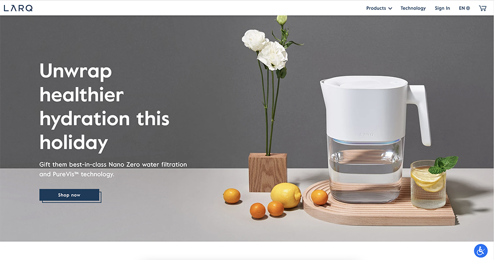
Larq is one of the best design eCommerce websites have to offer. Encouraging users to participate in their Bottle Movement and purchase their self-cleaning bottles, reusable water bottles, and pitcher. They accomplish this with an online site that’s simple to navigate with the help of the navigation bar that is located high up on their website. The site also has a trendy today section on the home page. Their layout is sleek and visually appealing, with stunning and clean pictures of the products.
2. Burrow
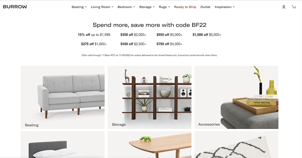
Burrow promises a different way of furniture through their modular pieces. Burrow is truly one of the best eCommerce website design examples. Their website promises to be a completely different experience, and the whole site is simplified by using the top navigation bar as well as an extensive section on the landing page where you can find certain types of items or even compare items. It is easy for users to locate what they’re looking for, create changes, and purchase with just a few clicks.
3. Revelry
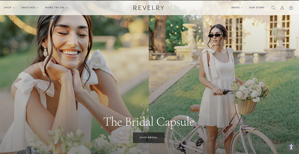
Introduce the world of online tailoring to wedding planning. Revelry provides swatches, free samples and in-home trials for all bridal parties. Their website is as innovative as the business they run. The navigation of categories is simple to follow and broken down into the ability to find swatches of fabrics, how to test dresses at home, color options, as well as an inspirational page for those starting to think about their wedding. They help their customers identify the category, style fabric, color, and style they are looking for.
Rackset professional web designers are here to design your custom ecommerce website. Start now!
4. Skullcandy
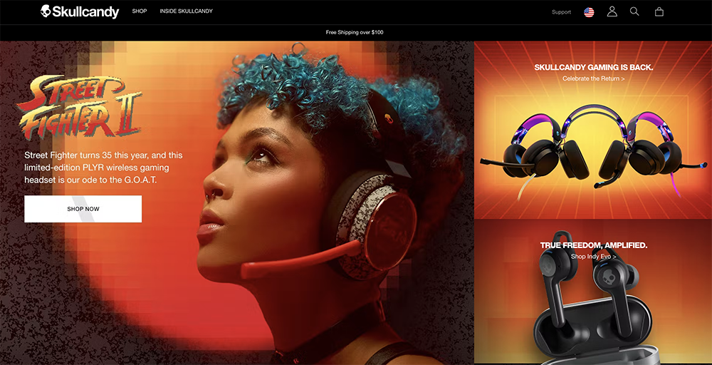
Skullcandy sells headphones, earbuds and other accessories that connect people with music. Their website is easy to see why they’re loved by so many. The whole site is adorned with a distinctive black background which is complemented by images of vibrant shades.
5. Solo stove
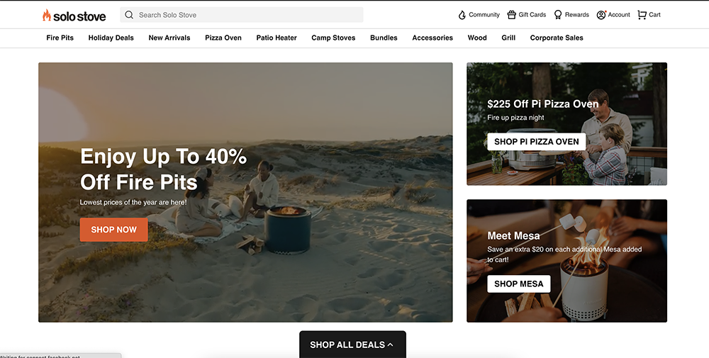
Solo Stove says its products are tough, simple to use, and well worth the cost. Their website promotes this notion by providing how-to videos and images and comprehensive FAQ sections. They went one step further with customized images for every category that will help customers understand what’s being offered.
6. Bliss
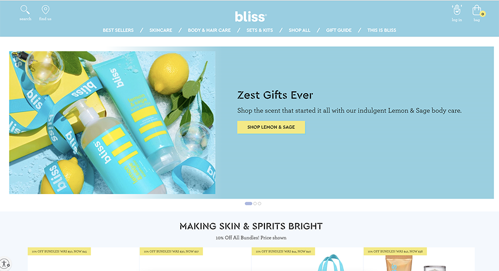
When you go to the Bliss site, you’ll feel as if you’re visiting an old acquaintance. It’s a brand that uses its website to reinforce the brand in the most effective ways, from the three colors that comprise the overall color scheme of the site to the content on every aspect that makes it easy to understand what their products are, and what the company represents, like being vegan and cruelty-free.
7. The Mountain
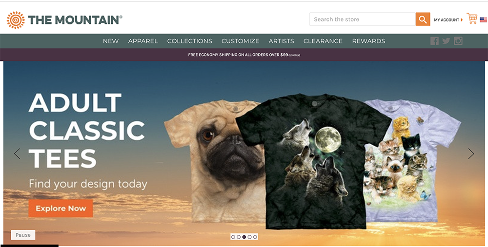
The Mountain is a perfect example of a company that offers numerous alternatives to make things easier for its customers. The Mountain has a wide selection of drinks, clothes and more that are focused on sustainability. The Mountain’s website makes use of its navigation bar, categories of products and service banners to make it easier to navigate the website.
8. Apple
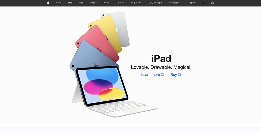
Many people are aware of Apple and its products, including iPhones, iPods, MacBooks, Apple Watch, and many more. Apple uses quality images to showcase its products. In addition, they make sure that their website is neat, so users aren’t lost among the choices. Comparing products is simple by using side-by-side technical specifications. They also offer a simple checkout procedure.
9. Grovemade
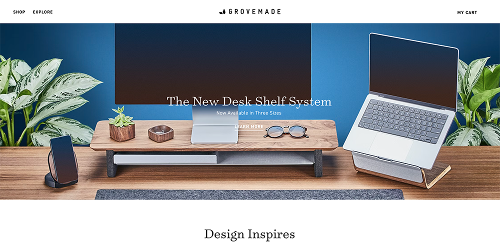
Grovemade is a maker of desk organization and accessories. Their website is a basic and classic style with stunning glamour photos of desks that showcase their top-quality products. Alongside the standard navigation menus, their homepage offers the option to shop for more than their featured products. Shoppers looking for ideas for their office will find some innovative options at the touch of an icon.
10. Spectacles

Spectacles sell spectacles that come with 3D video and photo capabilities. Additionally, their site excels in the way it organizes and uses images and other information to lure customers in. They also have an area specifically for creators, which includes filmmakers, artists and coders from all over the globe. Its checkout process is easy and simple to use.
11. Amazon
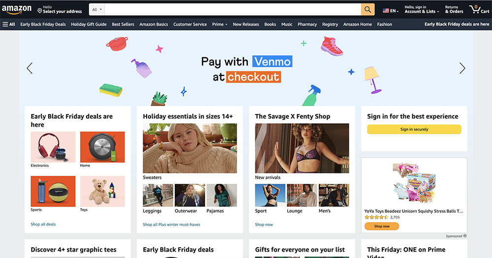
Amazon is among the biggest e-commerce sites that exist. It’s also an excellent example of a site that makes use of its design to make it simple for users to get the products they’re looking for. The search engine is able to perform basic searches and also filters to assist users in finding the information they require with minimal effort.
12. Spotify
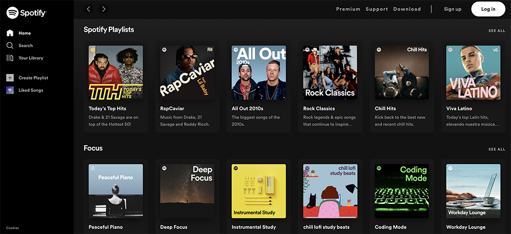
The well-known music streaming service Spotify does not just have a site that employs design elements to attract and inform customers. However, it’s also easy to navigate. They’ve kept it simple. The navigation bar offers choices for premium accounts, including customer support and downloading the app to supported devices.
13. Lookback
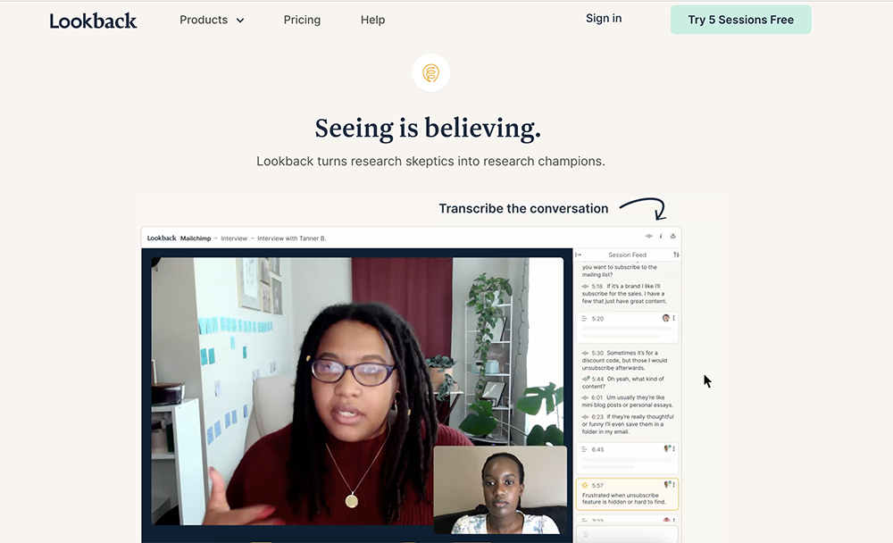
Lookback is a business that offers software to test websites applications, websites, and other prototypes. The layout of their website is designed in order to help you feel comfortable with their fonts and graphics. They follow that up with a video about their product which is professional and informative. It’s also easy to locate right on the home page.
14. Bacca
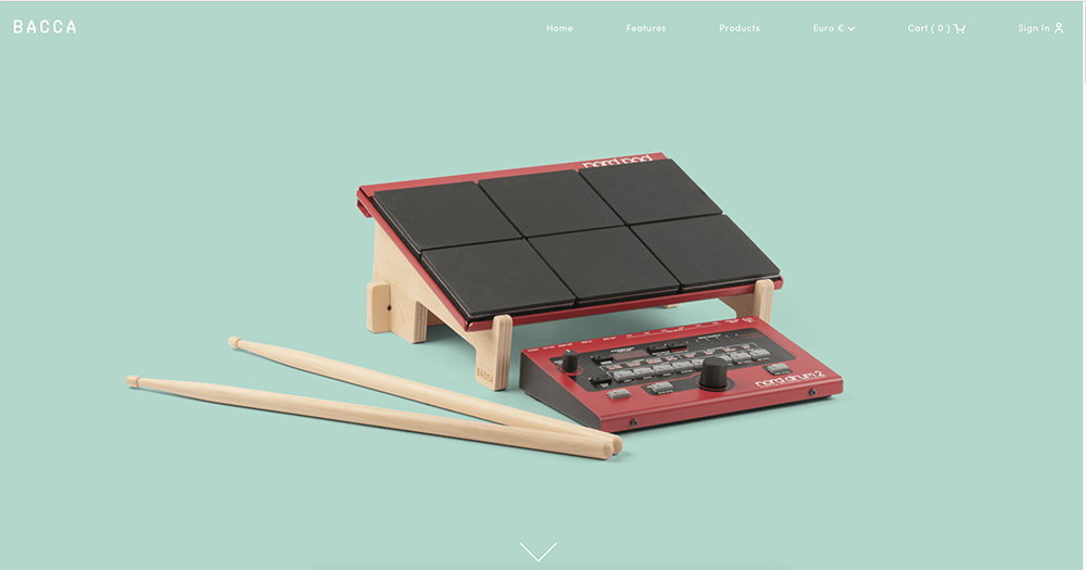
Bacca sells handmade wooden stands that can be used with laptops or instruments. The company showcases its products prominently on its website by using stunning images without backgrounds. This is why they stand out against the background of the site. The product pages are also in an option to display in full-width, making it easy to read every single detail.
15. Framer
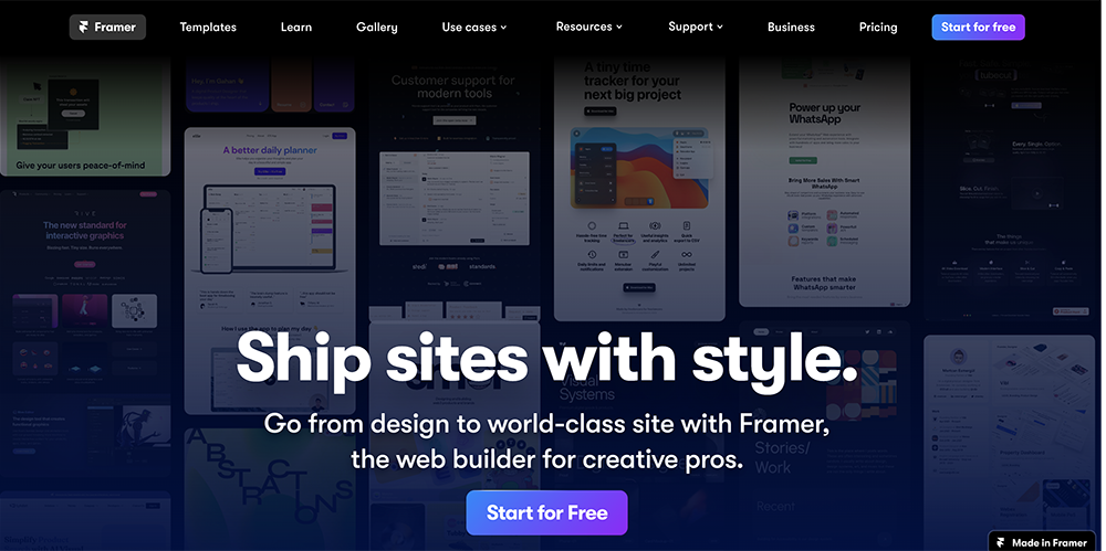
Framer offers interactive tools for engineers, designers, and product managers. They want to assist you in bringing those static concepts to life and have even used their own website to show the possibilities.
16. Ritual

Ritual is a women’s vitamin brand, recognized for its vibrant navy and yellow hue. It’s a color that is energetic and is the one we think of when we think of vitamins. When we look at this hue, we’re thinking that vitamins will help us feel more energetic by using them, and this is exactly the purpose Ritual seeks to achieve.
The navigation on the site is simple, with several categories for products available to purchase on the home page, including Multivitamins, Gut Health, Protein, and Pregnancy. The benefits of products are highlighted beneath these categories, to demonstrate the ways Ritual vitamins stand out from other vitamins available that are traceable and non-GMO suitable for vegans, without artificial colors.
17. Onfleet
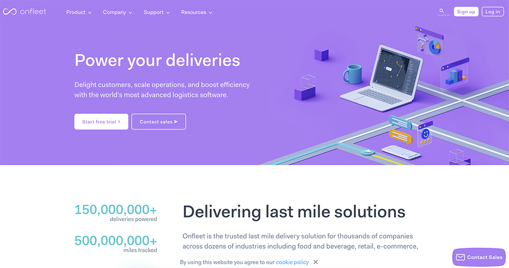
Onfleet offers tracking and delivery management software. Their website has a simple layout and includes numerous visual illustrations of how their software functions. They also employ a number of animations that look attractive and, when clicked, give additional information. On nearly every page, there’s a button to invite potential customers to sign up for the free trial or make contact with sales, giving plenty of opportunities to increase sales.
18. Welly
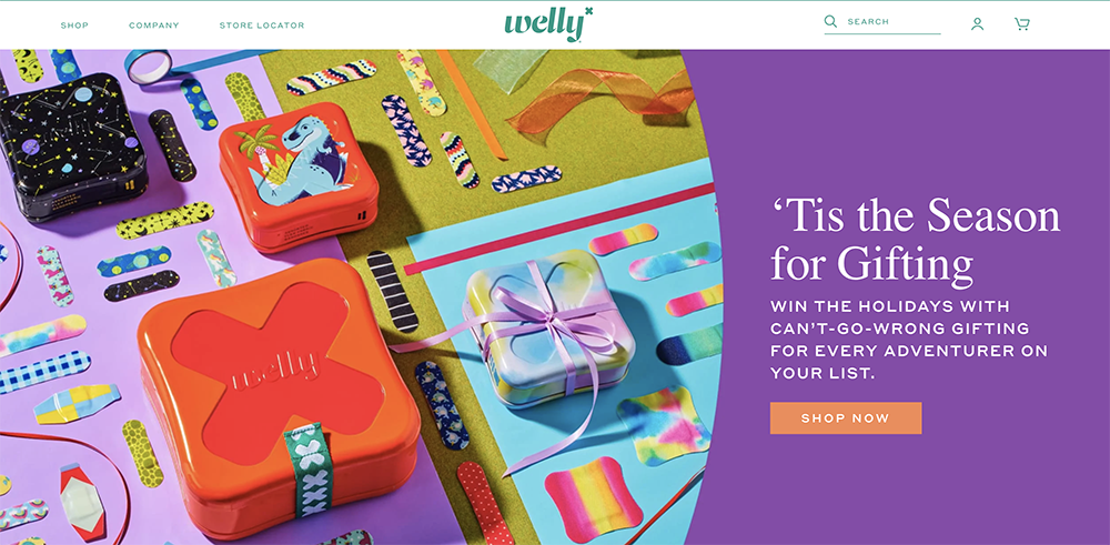
The company that provides first aid, Welly, is an excellent illustration of the minimalist online shopping experience. They have kept their white space and utilize only some other colors that are brand-named. The use of their colors in this manner makes it more user-friendly and simple to read their call-to-action (CTA) and is an effective way to boost conversion rates.
19. Bite
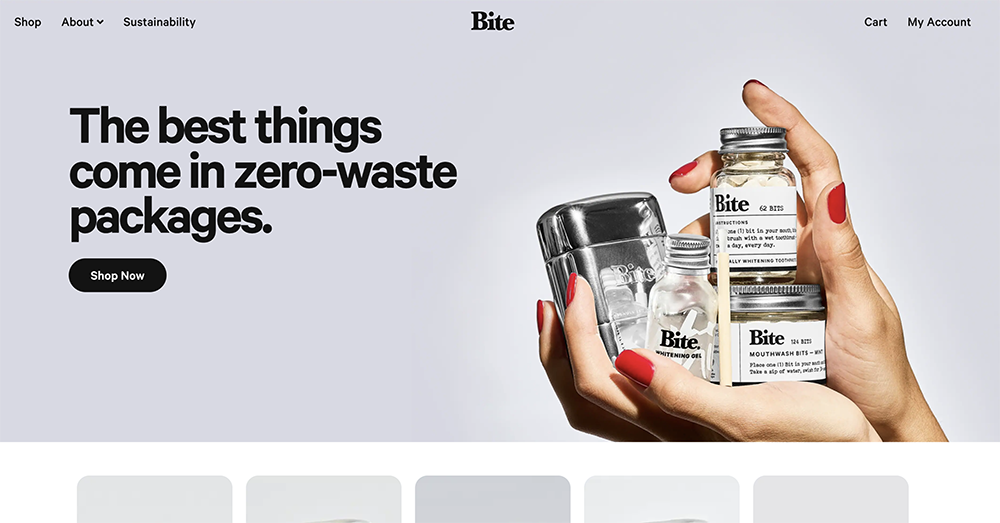
Bite sells all-natural toothpaste made from all-natural ingredients. Bites’ website makes use of typography and design elements to engage customers. The site also provides social proof, including reviews from magazines, as well as hyperlinks that appear on their homepage. They also feature many customer reviews and testimonials that make potential buyers feel confident when making a purchase.
20. Simply Chocolate
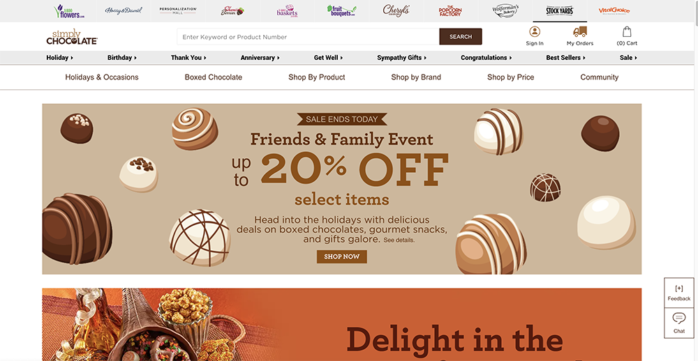
Simply Chocolate does things a bit differently, and its website is a captivating display of this, beginning with its navigation menu that is sideways.
The websites are designed to be dynamic and interactive to keep shoppers shopping, beginning with their homepage, which features an animation of candy pieces that move to keep you entertained while deciding on which direction to take next. The product pages have stunning glamour photos of the product as well as information about nutrition and the ingredients. The best thing, however, is that checkout screen.
Conclusion
We can look for some of the best eCommerce websites in almost every industry online. Nowadays, an online store is a must. But creating a website that keeps customers coming and returning time and time again in the face of the sea of competitors may require a bit more thought. In this article, we mentioned some of the best eCommerce website design examples and explained what exactly is an eCommerce website and how they work.
Leave a Reply