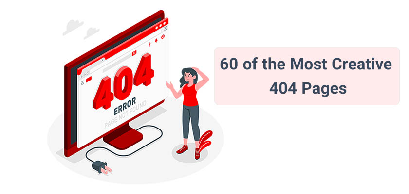
No one wants their website visitors to get lost. It happens, whether you like it or not, but there are ways to minimize that. There are a few reasons why people may leave your website and head over to your competitor. In this article, we would like to discuss what is page not found error or, in other and simpler words, what is 404 page? In addition, we will introduce you to 60 creative 404 pages and examples that you can implement into your website.
A great 404 error page can make a terrible experience into something wonderful. We are always praising good strategies to reduce downtime. It’s important to ensure that visitors don’t land on dead links or pages. We recommend that you put some thought into your 500- and 400-level error pages.
An engaging and clever error page can reinforce your brand message and increase visitors’ likelihood of staying on your website rather than leaving.
What Is a 404 page?
A 404 error page refers to a page that is displayed when a request triggers an HTTP 404 response code. This code indicates that the client, or “visitor,” was able to locate the server but not the destination. This means that they found your website, but not the page you have created. The server then sends a 404 response code to your browser, informing them of what has happened. A 404 error page will be loaded if the designer has designated one.
What about Other Error Pages?
Although the 404 error is the most commonly encountered, it’s just one of several errors that can be served.
A 400-level error is a three-digit error code beginning with a four like 404. This means that something went wrong for the client. In this case, the client is your web visitor. It’s also their browser. It makes sense that a URL misspelled is considered a client error. The site’s server (computer hosting it) is functioning fine.
Best 404 Error Pages Examples
Good UX designers and product managers know that you must accommodate users who go off-script. The humble 404 page is an integral part of any website, even if the ultimate goal is not to have customers see it.
Down below, we will look at some custom website designs as well as 404 error page examples. Additionally, we look at how large companies come up with 404 page design ideas and manage their 404 pages how they use them to recover from the bad experience of landing at a dead-end link. And how they accept responsibility while redirecting users to better pastures. Sometimes, they even add some brand development and humor.
Without further ado, let’s start with our custom website development ideas and 404-page design ideas that you can implement on your website.
01. Have Funny 404 Pages
Have fun with your 404 page. You can make it imaginative or bizarre as long as you communicate.
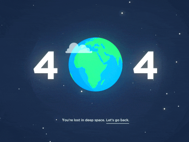
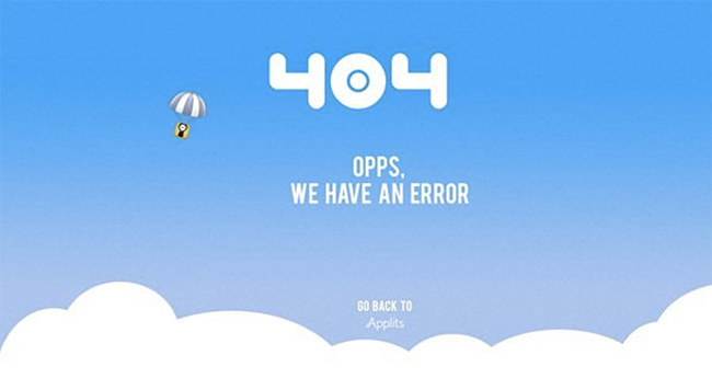
This fun 404 page will take you to outer space. This unique way of relaying the 404 error code is very interesting. The image can be viewed on Behance. It even moves, which adds another level of interest and entertainment.
02. Use Shapes in Your 404 Page Design
404-page design ideas can include shapes. Shapes can be used as both patterns and textures, or they can be combined to create new shapes.
This page uses icons to create a new shape, a question mark. This shape refers to the page’s purpose, which is the fact that the search query couldn’t be found. It would not have had texture and color if a simple, solid query mark had been used in its place.
03. Use Gifs in Your 404 Page
Visual movement can be created using a number of techniques. However, this is the 21st Century. Make it move if you want it to appear moving.
This idea of a custom website design for a 404-page is fun and adorable. The page’s visual appeal is still enjoyable, even if you don’t understand the language. Simple graphic gets an extra boost of energy by the tassels moving rather than staying stationary.
04. It Should be Simple
A beautiful 404 page can be extremely simple. You don’t have to make a complicated page if you aren’t sure what your brand is about.
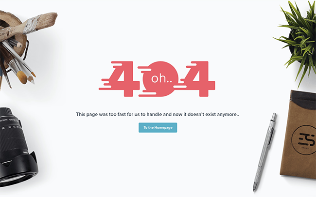
This page is simple but effective. The literal and metaphorical use of a magnifying lens to place the 404 texts is a great idea. It was a search for something, and you came across this page instead. It is clear that you understand the meaning of it without having it be explained to you.
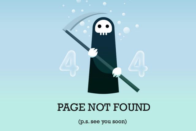
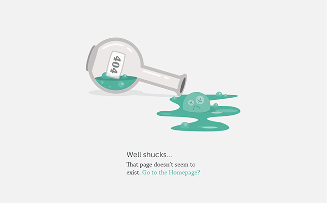
05. Use emotion
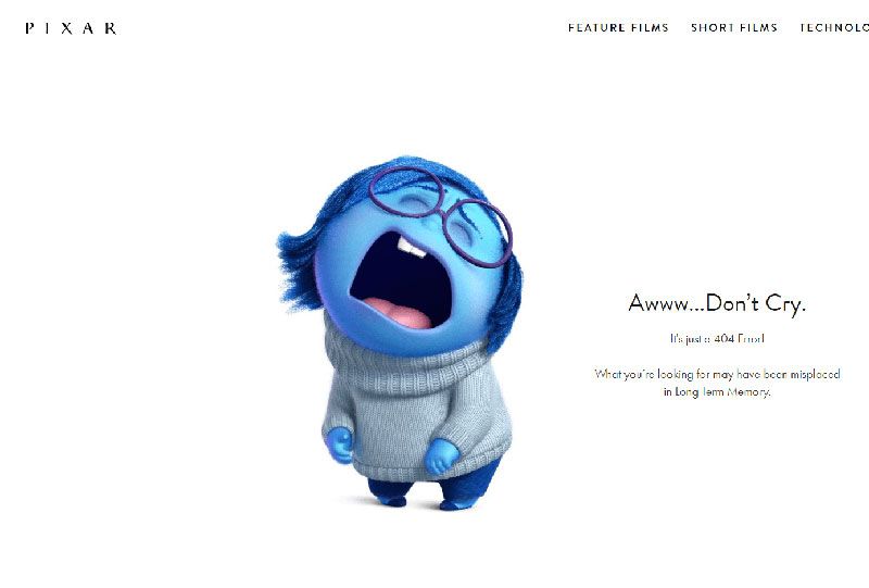
You can draw from the emotions of people. You can make people laugh, cry, reflect, and so much more. They will relate to your words because they are emotional by nature.
This page’s character tugs at your heartstrings. The page looks sad and regretful, but the text in the bar seems helpful. It’s almost hard not to feel sorry for the little guy.
06. Be Illustrative
The illustration is very popular and highly appreciated. The illustration is a creative and appreciated form of art. Why not include it on your 404 page?
This 404-page illustration serves two purposes. This illustration idea creates a scene for the 404 messages and gives you direction. You can get options from the pigeon by making eye contact with it.
07. Do not overthink it
You don’t have to be creative in order to create a unique page for 404 and come up with a custom website development. Look at the current trends and incorporate them into your page.
This page uses clip art characters that are popular on the internet. Although the character isn’t fully developed or rendered to perfection, it’s still fun and appropriate for the situation. The cape adds a unique twist to the message and gives the impression that not everyone is a winner or a hero.
08. Be real
Your 404 page doesn’t need to be vague about the topic. It’s okay to give a literal representation of the reason someone ended up where they are.
Typically robots represent the website or the internet, and it is starting to fall apart at the hinges. It is broken visually, indicating that the link you are trying to find may also be broken.
09. Stylize
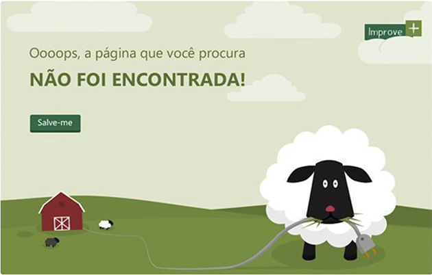
Illustrative work doesn’t necessarily have to look real. You can take liberties with your styling and style wherever you like. Illustrations become cartoonier and more approachable.
The illustration is really stylized by this 404 page. The simple shapes and flat colors work together to create a scene. Even the message is slightly stylized. The message is not technical. Instead, the sheep are responsible for the mishap.
10. Apply overlap

To create unique effects on your 404 pages, you can overlap letters and shapes.
The small overlap element would have made this page a bit too simple. This is a black-and-white scheme with a minimalist sans serif font. The lines added to the 404 give the page an extra layer of interest and reinforce the fact that nothing can be found.
11. Use relevant imagery
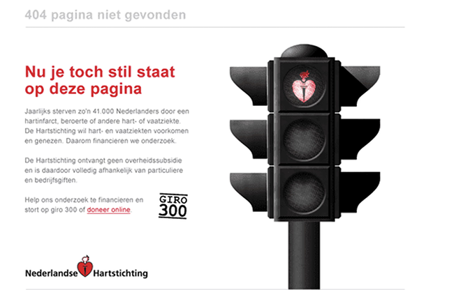
It can be fun to use images that aren’t very relevant to your page. However, it can also be a benefit to use images that make sense. It ties together the message and makes it more meaningful than just joking with an image and a witty one-liner.
This page shows how to use relevant imagery. You are notified by the red stoplight that something is wrong. Instead of using a simple red circle, they use the logo. This helps to reinforce the brand and adds creativity.
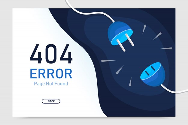
12. Use One or Two Colors
Choose a few colors that are compatible with each other or variations of one color, and then stick to it. This creates a consistent theme that can be used to simplify your design.
This page features a variety of shades and tints (darker or lighter) of blue. The tones are varied enough to not feel too blue, but there is a clear theme that ties everything together.
13. Texture in Design
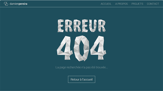
The web standard is flat color, so you can use texture to make your pages stand out from the rest.
This page’s 404 page still uses flat color, but the texture of the type gives it a unique flair that may not be possible otherwise. The page might have looked too busy and confusing if they had used the paper-like texture for the background and the darker teal for the text.
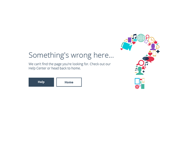
14. Offer Other Options
It’s crucial to provide direction to visitors who arrive at 404 pages. Is it better to direct them back than to return to your homepage? You can give them more direction, and they will be more likely to stay on your site instead of clicking away.
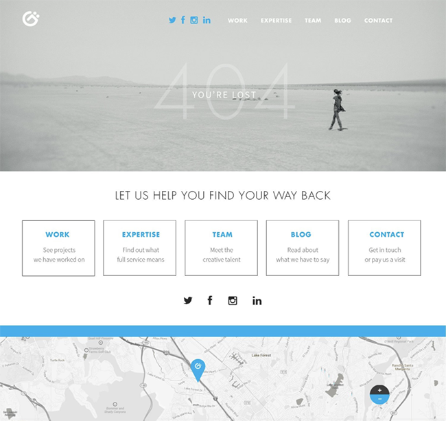
Visitors can have a lot of choices when they arrive at a page with a 404 error. Visitors can return to their home page, type in a search query, or visit the brand’s social media pages. They didn’t treat the page as a final destination. Instead, they made it work for them.
15. Be unconventional
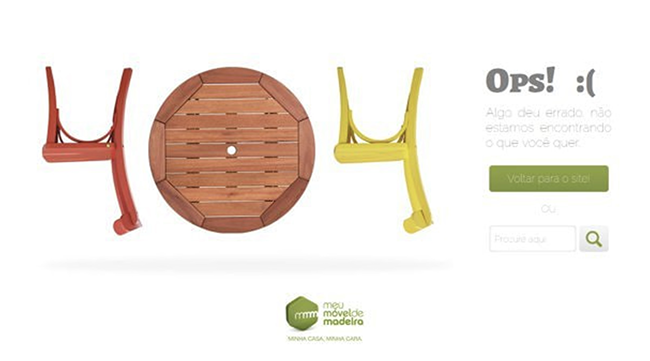
You don’t have to stick to the standard web fonts, colors, or imagery. You will be different from everyone else if you break the mold.
This page breaks the mold. They used furniture from their company to create the 404 symbols instead of using a regular typeface. This is a unique and engaging visual that breaks from the monotony of ordinary pages.
16. Leave Some Space
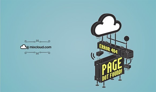
You don’t have to fill every inch of your page with content. Allow everything to breathe. It’s more effective that way.
The majority of the page is blank and blue. The logo and message are the only things that have been added to it. The space between them is large, giving the illusion that they are floating. This lends itself to cloudy aspects.
17. It can be a pun
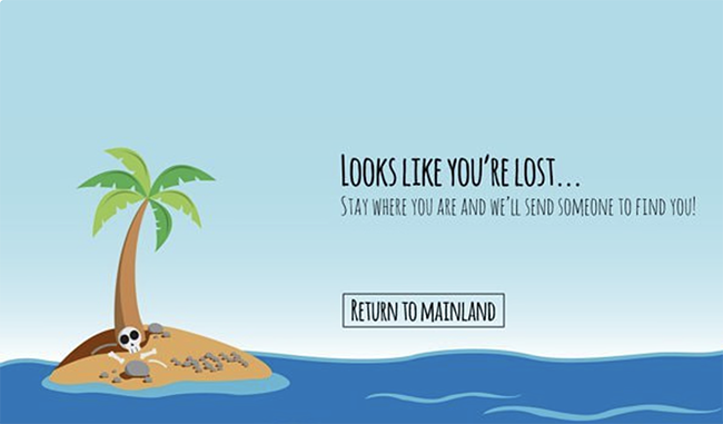
The 404 pages all focus on something that is not found. Why not capitalize on this fact? Consider common visuals and expressions that are related to the loss of something and create the scene with them.
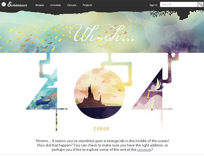
This page illustrates one of these things. It shows a visitor stranded on an island deserted and trying to find it (just like the visitor was looking for).
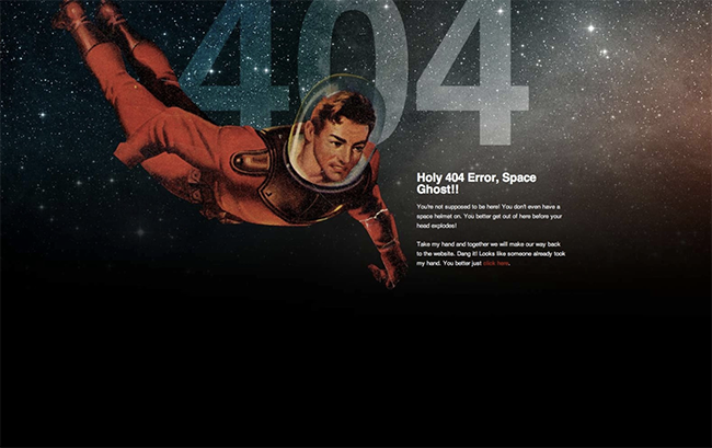
18. Be in a cheeky Manner
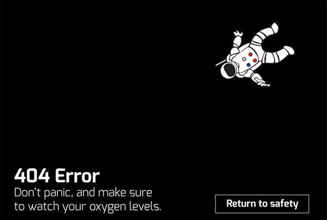
You can also use the 404 code to convey a humorous message.
It uses witty language to remind people not to panic and to monitor their oxygen levels. Instead of using a graphic, they used one of an astronaut who seems to be floating into space. Is that your message or the astronauts?
19. Use Dimensions
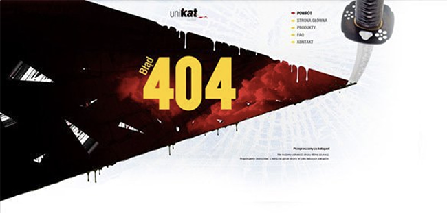
To create dimension and break the monotony of the web, layer different elements in your composition.
This page shows elements of the slicing blade that are not standard white. The contrast between dark red and black gives the knife more dimension. It stands out from the rest. It looks three-dimensional even though it is only two-dimensional.
20. All shapes are available in carry-on
Stick to the style that you choose for your page. You don’t want to add softer shapes to your page if you want sharp, angular designs. No matter what style you choose, make sure it is used in everything on your page, type included.
This is a more gentle approach. This typeface reflects the roundness of the clouds. They could have used a more pointed typeface, but it would have created too much tension.
21. Be Detailed
If you are more into being extravagantly decorative, then go for it. A well-done look can give your page a more sophisticated feel.
This page beautifully combines intricate details with a simple background of white. The bright illustration is incorporated into the text, creating little windows that allow you to see through. It’s easier to cut it with white than carry it through the entire length. This ensures it doesn’t get too busy, and it still translates.
22. Use aspects of your brand
What is your brand doing? Is it possible to show it visually in a creative manner? It could be displayed visually on your 404 page.
The floral company switched out the zero in 404 to a flower. It personalizes the page and lets visitors know about their brand.
23. Give Informative in Your 404 Page
You don’t want visitors to be overwhelmed by the options on your 404 page. Give them a clear direction.
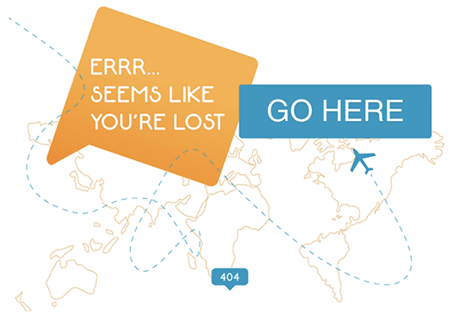
Although this page doesn’t have a lot of information, it will tell you what to do next. Although you don’t know exactly where you are going, knowing the location will help you have more success. It’s a nice touch to have an airplane path, which becomes clearer as it approaches the button that you need to click.
24. Use Different Mediums
You don’t have to create everything on your 404 page in a digital format. You might think outside the box and use a tangible medium.
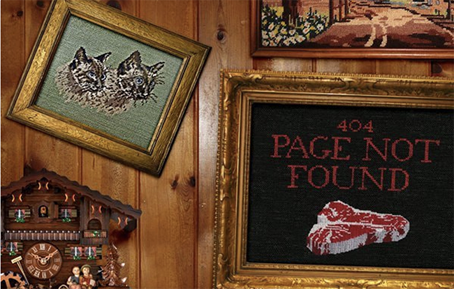
This page features different embroideries that have different images. It is the most prominent one, and for a good reason. It is also paired with other, more homier-looking ones. It works well, even though it looks odd at first. It’s easy to use and quite quirky.
25. Experience a Different World
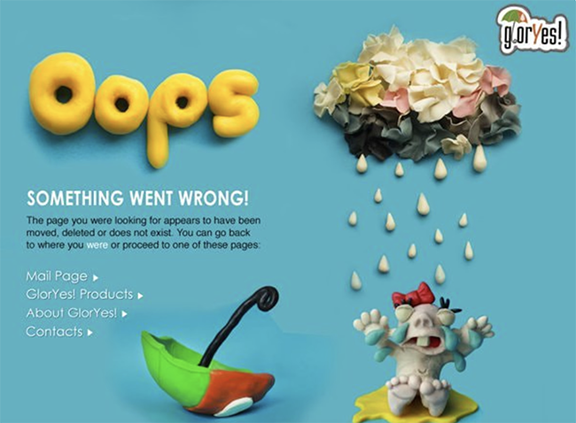
As with the previous tip, take a break from the programs for a while. Get creative with your hands.
This page features hand-made clay figures rather than flat illustrations. Because it is hand-crafted, it stands out among other 404 pages. It is a character, and it is relatable.
26. Split text
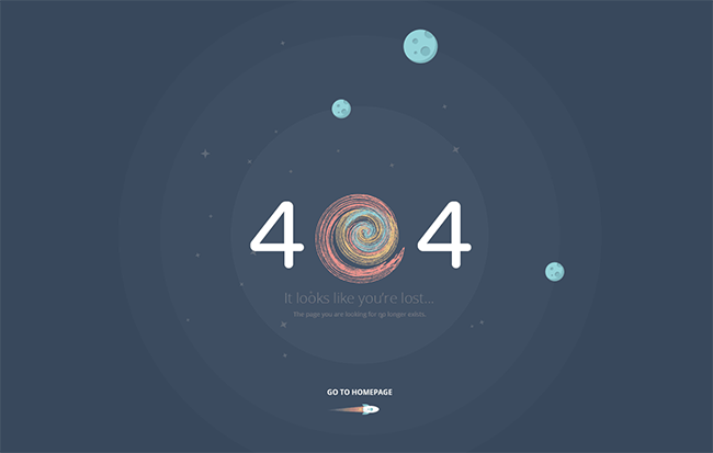
Do not feel obliged to translate information using text when you could use something more creative.
This page incorporates the space theme into the text. It replaces the zero with a galactic swirl. It works well with the composition and is related to the circular shapes that are repeated throughout the page (the stars, planets, and radiating blue circles).
27. Establish an emotional connection
You’ve achieved something powerful if you are able to create a connection between a visitor and your page. Appeal to their emotions, and they will connect with your brand.
The imagery and text are very emotive. The text shows two people with a connection. When you read it, you can imagine them on the open road, no destination, in particular, going wherever the roads take them. This is a concept that most people can understand and want to live by, but it’s just too practical to actually do.
28. Utilize photography
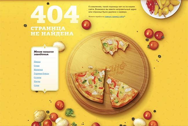
To draw attention to your page, use beautiful photos. There are many ways to use cameras today, and you can get very creative with the way you shoot.
This page uses vibrant photography and delicious food to make an otherwise unpleasant situation more bearable. The bright yellow gives the page a happy feel.
29. Make use of motion
You can create motion without actually moving things on the page. It can create a very interesting effect if done right.
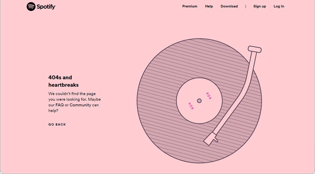
This page’s text has a very powerful movement. It isn’t overdone, and it translates enough motion. It is relevant to the message and helps to drive the motion home.
30. Implement a pop culture
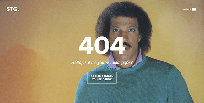
Your 404 page should be a memorable one that appeals to large audiences. Humor is a great way to show your personality, and it’s a good idea to have a bit of humor.
This 404 page is hilarious. This page is a classic Lionel Richie photo paired with one of his most famous lyrics. It is mainstream enough to be understood by younger people and not lose out on the older ones.
31. Be symbolic
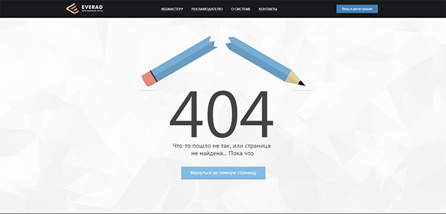
Use symbolism to create a connection between imagery and messaging on your page. As long as the symbol makes sense, it can be literal or figurative.
The symbolism of the broken link that got you to this page is represented by a broken pencil. It makes sense, and even if you don’t understand the error code, you will get the gist.
32. Create contrast
Contrast is important to ensure that your page does not look flat. It is important to have a hierarchy. The most important items should be prominent against the rest.
This page is a contrast of color and design. The vibrant buttons are made more prominent by the dark background. They are more attractive, and therefore you are more likely to interact.
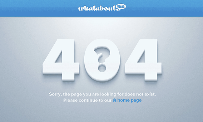
33. Use icons
![]()
Iconography can simplify your pages. It’s easier to read if you use icons in place of text.
This page uses a compass to tell you when something is up. It is the main focal point, and all other elements around it are simplified. It is in keeping with the branding, which features a whale as the logo. It lends itself well to simplicity, even though it could be more effective if it were more detailed.
34. Choose a Theme
Choose a theme that you like and use it throughout your site. A consistent theme will help your pages work better together and be more cohesive.
This theme is used to draw the logo color. From the logo to the illustration and down to the footer, the teal color is used. It would have been too busy and disjointed if different colors were used in each area.
35. Make it relatable
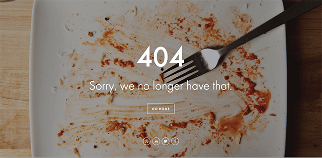
Your audience will be more likely to relate to your brand if you use imagery they can relate to.
This 404-page imagery is both relatable to the audience as well as the message. Everyone is familiar with what a clean plate looks like after dinner. The message of “no longer having this” is directly related to the image. The photography shows that what was once there is no longer.
36. Take into Account the Space
A picture or illustration doesn’t need to be perfectly placed within the space. It can feel unnatural if everything is perfectly symmetrical and perfect.
This page uses an illustration. It’s centered but makes it feel natural. It feels like it was painted onto the background and not just placed there.
37. Do not be afraid of the crowd
Do not be afraid to leave large spaces on your page. You can experiment with placing a few items together if you only have a handful of things.
This page is 404 and leaves a lot of black at its bottom. They decided to combine the text and astronaut instead of spacing them out. They could have spaced them, but the outer space effect (the stars melting into black) would not have occurred if they did.
38. Cutouts are a great idea
You are free to take out parts of your text and imagery. It doesn’t mean that you have to use the original, unaltered form of something. You can experiment with the changes that occur when parts are removed or added.
The 404 page is very simple. The page could have been complicated if the question mark had not been removed from the zero. This adds an extra touch and makes it easy to read the zero as a zero.
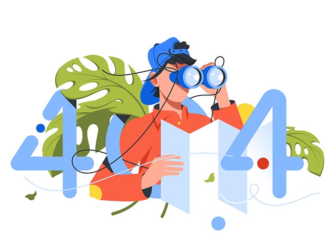
39. Make it simple to understand
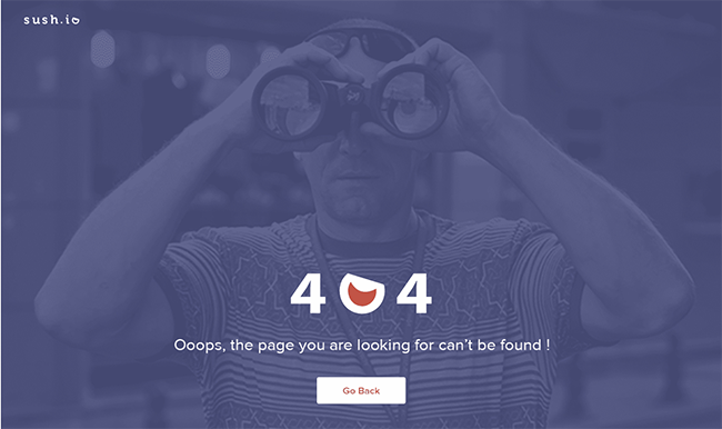
A few people may not be familiar with a 404 page. It doesn’t need to be written out but illustrated.
The 404 page is quite literal. It displays the 404 code and a line of text stating that the page cannot be found. There is also an image of a man using binoculars to search for something. It’s easy to understand, even for the most inexperienced internet users.
40. Show a Scene
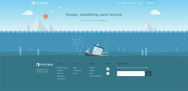
On your 404 page, create a scene. There is an entire page that you can use to tell a story.
This page has a cute scene. The sunken boat is hidden just below the water surface. In the background, the mountains can be seen. The boat is still being used by a fisherman, who can be seen fishing from it. The scene seamlessly transitions into the informational section of this page. There is no loss in either.
41. Be Experimental
You should not be afraid to try new things with your 404 page. You can break conventions and push the limits. You can always go back if you push too hard, but you won’t know what the future holds if you don’t push.
This 404 page has a lot of information. Different fonts and imagery are used, colors shift, and texture is used in different areas. It still works, despite all the changes. It is all balanced and not overwhelming.
42. Be Bright
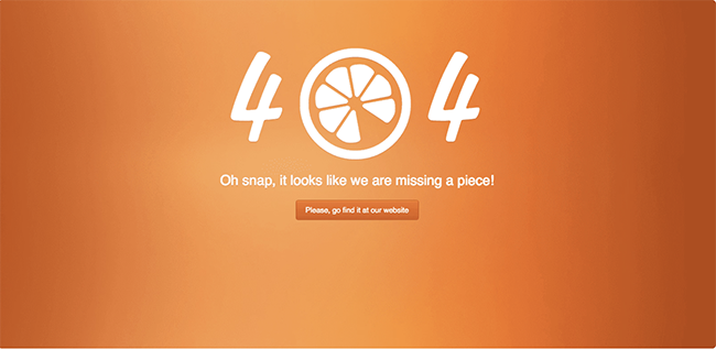
Bright colors can draw attention and give your site a personality. Do not feel pressured to make it look dull just because it is a 404 page.
The 404 page of this 404 page features bright orange. Because it is related to the orange image on the 404, the orange color works well. This page has a pleasant, bright brightness, thanks to the subtle gradient.
43. Don’t Limit Yourself
You don’t have to design a page for a computer screen just because it’s going to end up on the screen. You can be flexible and experiment with other dimensions.
This 404 page, instead of filling the screen with the message, fills it with the message. This unique solution is a great alternative to what could be just another website page. Even though it is small, the message can still be clearly read.
44. It is best to box it
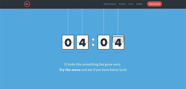
Try boxing your numbers and letters. This can be used to create separation in your design, where it is needed.
This page has the effect of a clock. The 404 is contained in rectangular boxes. It looks as though it is about to change.
45. Be creative
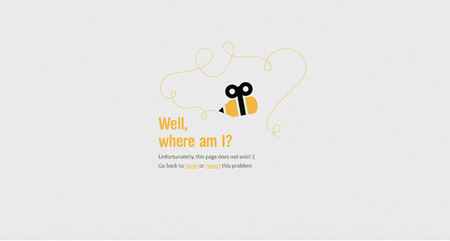
You can take liberties with one thing and make it into another. You have the power to create anything you like, and it’s your page!
Is it a pencil? Could it be a pencil? Both? The creator combined both of them on this 404 page. It looks like the trail it left behind is drawn with the pencil end (or the stinger). It is supposed to be a honey bee because the colors are related.
46. Be Unpleasant
It’s okay to be cheesy, and it can make you feel good. You don’t need to go overboard. Just find the right balance for you.
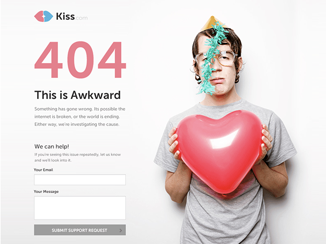
This 404 page is a dating site. It’s the perfect combination of cheesiness and humor. It is a very sad story, but it makes you laugh a little.
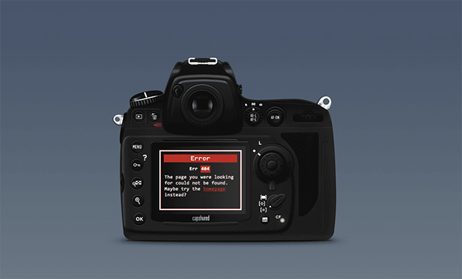
47. Give it an edge
Edgy looks great, no matter how sharp or angular they are.
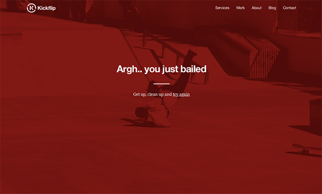
This page was bold in its attitude and its look. Skateboarding is very popular among younger generations and has its own attitude. Skateboarding has an edge when the message “you just bail” is paired with the subtext. The photo is related to the text, and the red filter gives it a more intense look.
48. Push boundaries
Consider what might seem a little too difficult for someone to handle and then move on. People love to be taken by surprise and taken aback.
This page is gross. What do you think of a sweaty office man who can’t keep his pants from your face? It’s gross and very uncomfortable. The way that the text was created from grossness is quite interesting, and the expression is perfect.
49. Use Patterns
It is possible to make patterns from almost anything. Photographs, illustrations, icons, colors, shapes – you name it. You can add an extra dimension to your design with patterns. So get creative!
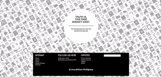
The background of this page is created using different images. They are washed out so that they don’t interfere with the text and create a subtle texture. They can be used to increase interest in simple black-and-white schemes.
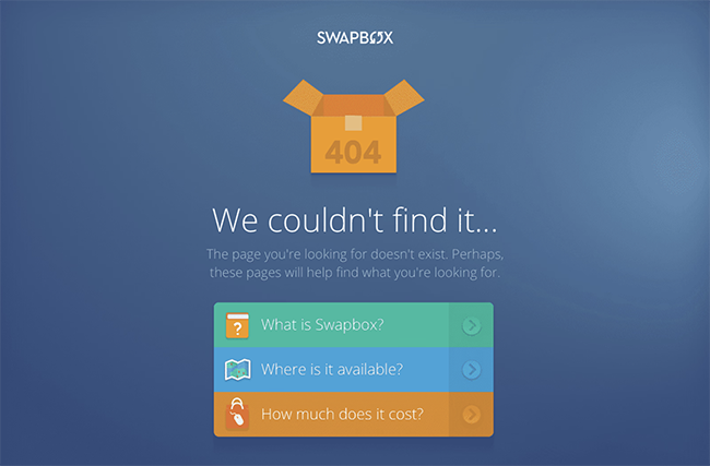
50. Layers of information are a must
Break down your 404 page if you have too many options for how to fix the problem or where to go next.
Although this page has a lot of useful information and sources, it is organized in an efficient and clean way. Each section is clearly separated from the rest. This makes it much easier to make a decision.
Let’s See Some Specific 404 Error Page Designs of Popular Websites.
51. Amazon
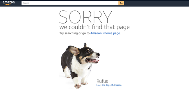
Say hello to the dog’s Amazon’s 404 page gives you a glimpse into their culture, including obligatory adorable puppy photos. Amazon immediately takes responsibility for any error, even if it’s not their fault. The 404 page displays a message in large capitals stating that the page is incorrect.
52. Flickr
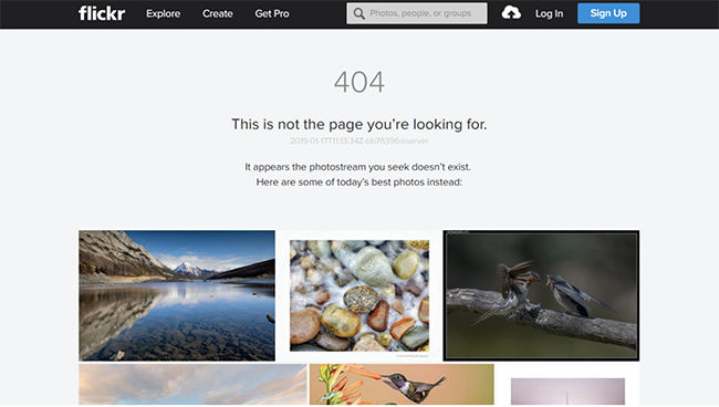
Even users who accidentally stumbled upon it will likely stay for a while.
53. Adobe
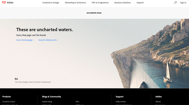
Adobe’s photo editor is powerful enough to produce a mind-bending photo and match an idiom. From that point, the user can choose to search or return to the homepage.
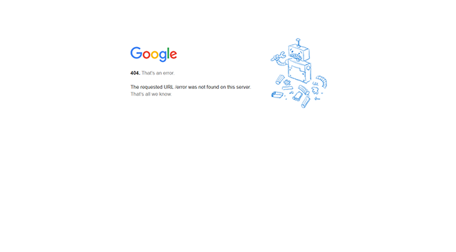
54. Google
As we said, Google keeps things simple. Google keeps it simple. A broken robot image and a technical error message. This is probably a testimony to their engineering roots and the focus on finding the right answer every time.
55. Awwwards
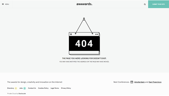
Awwward’s page 404 uses stark imagery and all caps to convey to visitors that they haven’t reached their destination. It is especially difficult to read the capitalized text, which causes users to take longer trips than they would prefer.
56. Canva
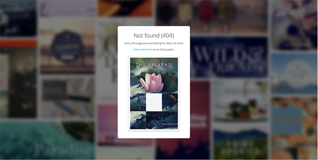
If you have the time, a fun game can be a great way for lost visitors to entertain themselves. It was a great addition to this list.
57. Dribbble
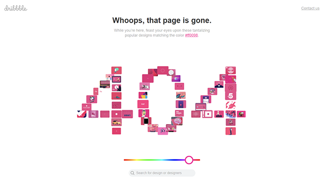
Dribbble is a site for designers who are looking for inspiration. They let visitors pick a color and give them links to other designs. Another example of a website page 404 page that truly understands their customers and works hard to provide that content wherever they go.
58. Behance
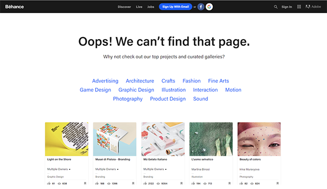
Behance is similar to Dribbble but offers designers visual inspiration. However, it’s a bit more boring than Dribbble. They act as a search engine for the ’00s, showing delinquent users a list with all projects and categories, and showcasing some of the most popular design projects to help them get on track.
59. Designer News
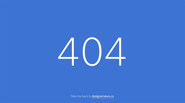
Simplicity is often a sign of its own strength. Designer News’ page 404 conveys the message well. Bonus points for not taking over a month to implement.
60. Instagram
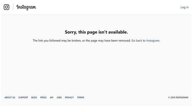
Simple page with poor copywriting. If you don’t look deeper, the headline could be read as “this page exists, but you can’t get it.” This visitor’s day is just a little more miserable after seeing this.


Leave a Reply