The importance of user experience design cannot be overemphasized with 1.5 billion websites worldwide. User experience (UX), is how customers perceive a brand. Businesses today need to be more creative in order to attract customers and convert them seamlessly.
It is clear that 94% of first impressions of websites are based on their UX. These fundamental elements directly impact traffic and conversions. It doesn’t really matter how helpful your website or product are. It is useless if it has a poor or outdated design. UI and UX design are the best ways to attract customers and make your company stand out from competitors.
You must know what trends are likely to gain traction. To make your UX look and feel awesome you need to have either a custom WordPress website design or an eye on UI and UX design trends 2022.
Let’s now look at the UI design examples as well as UX design examples. Below, we will look at some UI/UX design trends of 2022.
What is UX Design?
We’ll begin by defining UX, which is an abbreviation for “user experience.” It is the manner in which individuals engage with a product that we refer to as the “user experience.” For example, when we wish to turn on a light in our room, we must interact with a light switch to do this. How we feel about the encounter may be influenced by the design of the switch, which may include the color, material, and physical look.
In a similar vein, user experience (UX) refers to anything that impacts a user’s engagement with a digital product in the digital design industry. Below, we will talk about UX design trends of 2022 as well as UX design examples in real life which is known as Augmented Reality.
What is UI Design?
When it comes to software or electronic devices, user interface (UI) design is the process that designers employ to create interfaces that are pleasing to the eye or have a particular style. Designers strive to develop user interfaces that are both simple to use and enjoyable to interact with. UI design relates to the creation of graphical user interfaces and other kinds of user interfaces, such as voice-controlled interfaces. Below, we will talk about UI design trends of 2022.
What Are the Most Popular 22 UI/UX Design Trends in 2021 – 2022
You may want to follow a design trend because you want to feel like you belong somewhere. It is the main reason why customers often want something “in style.” They are looking for something safe, something that they are familiar with, and something that will not offend or annoy others and if that is the objective, then just go with the flow and produce something that appears generic and similar to what everyone else is doing.
In certain instances, it may be beneficial to seem “trendy” in order to assist a new, emerging company to appear more legitimate in relation to the present period. Here’s a list of top UI/UX design trends of 2021/2022.
1. Dark Mode
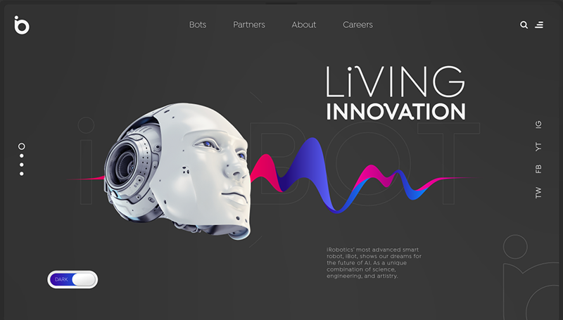
This trend is a timeless classic and will be a popular trend in 2021. Many interfaces offer a dark mode that users can switch to. UX in dark mode not only evokes elegance, prestige and sleekness but also reduces eye strain and helps with battery consumption.
2. Minimalist UI
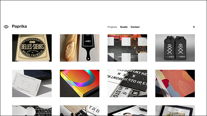
There are so many distractions around – pop-ups targeted ads, notifications and notifications – that YouTube even forces you to view up to two ads each time you watch a video. Minimalism offers consumers a refreshing alternative.
A new trend is to strip down products to their essentials. By removing all distractions, consumers can focus on what is truly important.
You can clean up your design by reducing unnecessary content. Use design elements like carousels, toggles to show & hide sections of content, pop-ups or tool-tips.
It can be described as Marie Kondo-ing the UX. This is to clear out clutter and eliminate unnecessary items. The digital clutter will be welcomed by consumers as a refreshing break from the noise and chaos of the digital world.
3. Artificial Intelligence (AI)
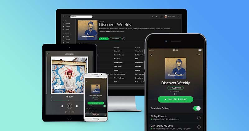
Without AI, it is impossible to offer personalized online service. Machine learning is being used to improve user experience in data-based AI. This trend will be prevalent for almost all products. AI allows businesses to automate personalization which increases conversions and customer satisfaction.
There are some solid UX examples that users have chosen to use AI. Spotify is one such example. It combines integrated machine learning with AI implementation. Spotify creates a playlist called “Discover Weekly”, which is a collection of songs that are tailored to each user based on their listening habits.
Because it is personalized to users’ interests and preferences, this helps you create a meaningful UX that they will return to. It’s also a valuable feature that allows users to easily discover new music.
4. Illustrations
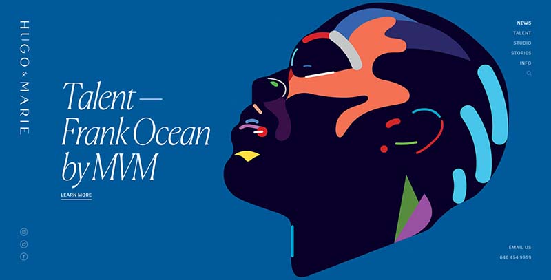
Hand-drawing is the most popular style nowadays. Illustrations are more than words and language. They can be used to tell stories and create onboardings. It is not only eye-catching, but also provides information to the consumer.
While there are many examples of UX design in practice, let’s focus on Dropbox. Illustrations are used to show how they can help users avoid disruptions and get organized.
5. Animations & Motion Design
Although animations and motion designs can be expensive and time-consuming to make, they are highly visual content that will become UI/UX trends in 2022. Websites are increasingly using videos as their main visual content and interactive video tutorials to assist users.
Motion design and animations are engaging and draw attention to users. They are useful in demonstrating how the product works, or telling a story that communicates value.
6. Creative Scrolls
Creative scrolls are becoming more popular, but this UX design trend is best used for products. The website for AirPods Pro by Apple is completely creatively scrolling. It brilliantly displays various details about the product as well as descriptions of its features.
7. UX Writing and Microcopy
Standard phrases are all we see, which is fine but lacks personality. Use a conversational tone to make your website more engaging.
Medium is a website which is taking advantage the UI design trends for 2022.
They are aware that they have distracted users and offer an apology in the heading.
8. Micro-interactions
This is one of many ways to improve UX. This is a long-lasting trend that will not fade. Micro-interactions can be informative for users and reassuring that they have had an interaction. They also keep them updated about the progress.
9. Mobile-Friendly Design
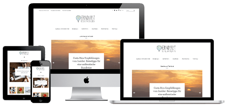
Mobile-friendly is a key UI design trend for 2022. It has been growing through the years. This is especially true in Southeast Asia, where many people would reach first for their mobile phones before any other devices.
Statista reported in March 2021 that mobile devices account worldwide for more than 54% of all web page views. Mobile phones account for two-thirds (or more) of all web traffic in Asia.
It is safe to say that a mobile-friendly design will be a must as there is a growing trend for users using their mobile phones as the main device.
Websites and apps must be mobile-friendly. They should be as responsive, feature-rich and functional on mobile phones as on desktops.
10. User Interface Design for Wearables
As a result, wearable technology is growing in popularity. To enhance the functionality of mobile devices, popular wearables such as smartwatches and smart glasses, wireless headsets and earbuds are often combined with smartwatches.
Statista reports that the global number of connected wearable devices has increased from 325 million in 2016, to 722 millions in 2019, with more than a billion expected by 2022.
Wearable technology provides consumers with the connectivity, durability, capabilities, simplicity, and connection that they require. This trend is expected to continue.
Wearable technology is expected to function in this way as an extension of the cellphones of users. Wearable technology is not only becoming popular among ordinary consumers but also in many other sectors, especially the healthcare sector, which has many uses.
11. Voice-Activated User Interfaces (VUI)
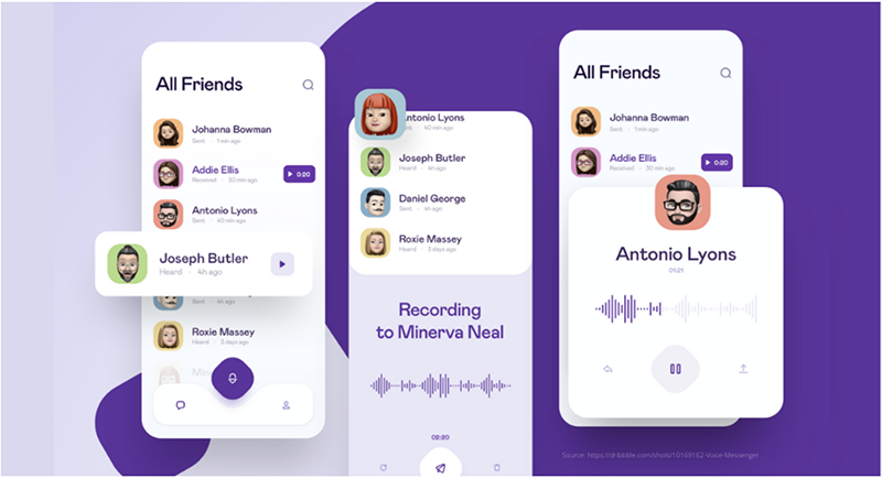
Voice assistants powered artificial intelligence (AI), such as Siri, Alexa, Tencent Dingdang and Microsoft Xiaoice offer consumers a greater level of convenience and are growing in popularity.
Voice user interfaces (VUIs) allow users to speak to their VUI to receive an answer, rather than searching for it on their phones. This makes them more productive.
VUI is rapidly becoming a standard component of smart devices that we use every day. The UI design trends suggest that VUI will be used by 8.4 billion people worldwide by 2024.
Juniper Research predicts that China’s number of voice assistants will rise from 4 million to 100 million in 2024. This is due to the low cost of smart speakers. To achieve success, Chinese manufacturers are focusing their efforts on developing more sophisticated voice assistants that draw upon brand functions like skincare, beauty assistants and wellness coaches.
Voice assistants can be used to provide convenience services for users, and they are ingrained into their users’ daily lives. Xiaodu smart speaker, for instance, was designed to benefit families with children or elderly parents.
Xiaodu has a smart display built in with a kid mode to limit the amount of content and time that can be accessed on the device. These smart gadgets also include a video calling function that allows children to communicate with their parents at work. Additionally, they have partnered with online educational institutions to offer early childhood education through their devices.
12. Fonts Selection
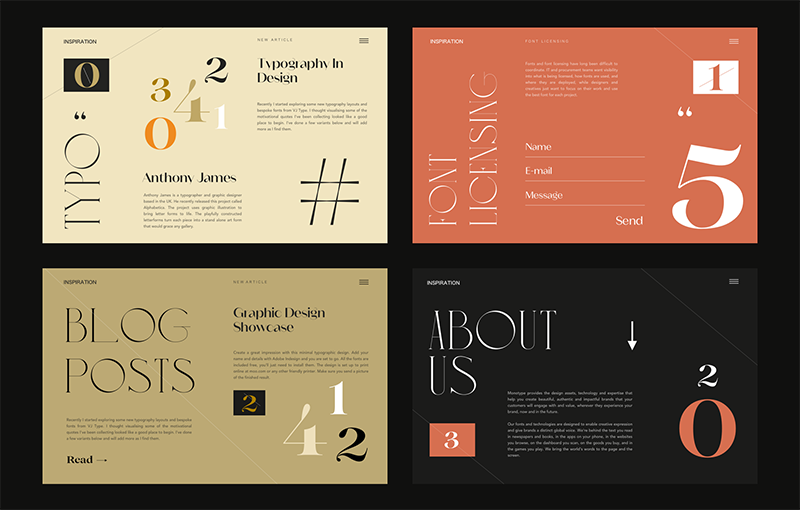
If you want your text to be more than just a collection of words on a screen, font selection is critical. A distinction may be made by using a variety of different styles and approaches, whether they are bold, stylized, or plain forward.
Every designer understands how critical it is to choose the appropriate font for a website, product, or software program. Customers often connect a specific typeface with a well-known company. If it weren’t for Google, no one would have heard about Roboto. This front was produced by the Internet behemoth and shown to the whole globe.
Many user interfaces will employ distinctive, thick, and colorful fonts to draw the user’s attention to the areas they believe the user should concentrate on.
This is an ingenious method for designers to lead consumers through their experiences and help them direct them in a more predictable manner.
It has been gradually growing in popularity for quite some time, and there is no reason to believe that this trend will reverse itself. It is a helpful technique for attracting someone’s attention in a manner that does not need a significant lot of work on your part.
13. Expressive Colors
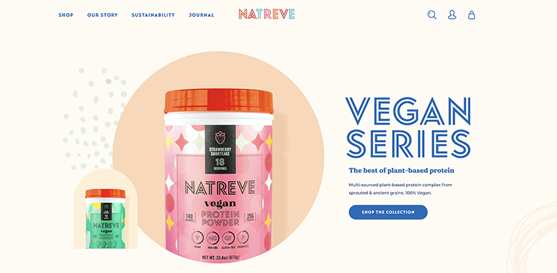
Website designers are well aware that in order to elicit the desired response from their users, they must first elicit certain emotions in them. Something that they can communicate to consumers via the design, whether it’s a certain emotion they want to be connected with their brand or a concept they want to communicate.
Expressionist and directive colors in the design of your website may be used to influence emotions and actions by a designer. If you want people to feel energized, utilize colors like oranges, reds, and yellows in your design. If you want to make someone cheerful, use light blue, green, or pastel colors in your design.
Certain colors have been linked with particular emotions, and some have even been shown to be capable of evoking such feelings, according to anecdotal evidence. When it comes to psychology, the scientific community is steadily amassing empirical data in order to better understand the psychological impact of color.
14. Interactive Animations
Even while the primary goal of design is to facilitate communication and the transmission of information, digital design has the potential to facilitate digital engagement as well as the gathering of feedback. Micro-interactions are defined as brief periods of time during which a user performs an action (such as clicking on a button) that results in the website responding in a certain way. The goal of these elements is to create a sense of visual and tactile pleasure.
Animations are intended to provide more than just amusement, and they encourage your users to interact with various elements across the site. More time spent on a page increases the likelihood that a measurable action will be completed.
15. 3D Elements
Although the usage of 3D components is not new, the quality of their designs has improved significantly over the years, and we do not expect this to change very soon. They may be used to give goods a realistic feel, such as with the new macOS, or to give them a modernistic appearance, such as with the new macOS. This results in a rise in sales as a result of the increased realism.
Even when adopting a basic approach to website design, 3D components may provide a certain oomph factor to the final product without being overwhelming in their use. It has been discovered that sophisticated 3D components take a long time to load, which is clearly a deterrent for consumers to remain on a website or app for an extended period of time. Developers are actively working on this issue, and we expect to see significant improvements in both loading speeds and element quality in the near future.
16. Visualization in Abstraction
There is no way to make a table or graph seem less boring and out of date, no matter how much you “dress it up.” As a result, designers will progressively use more aesthetically pleasing methods of presenting the information. Our ability to capture the user’s attention and expose them to the subject material in a shorter period of time is made possible by adding graphics and components that the user may also interact with. Furthermore, it is very unique and will make a more lasting impact on the recipient.
17. Typography
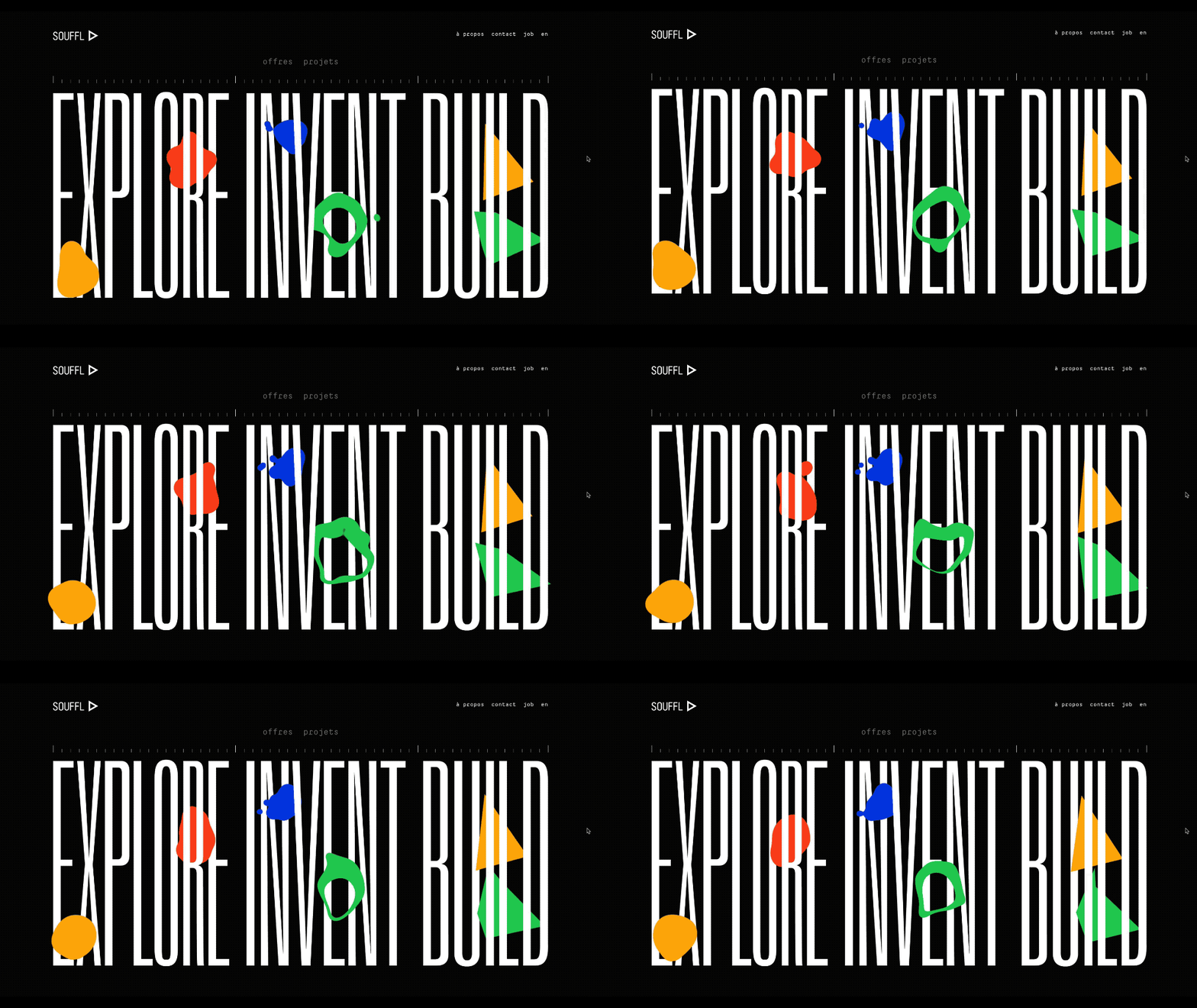
Changing the typefaces in an application is the quickest and most straightforward method to give it a new appearance. Although eye-catching typographic designs may be captivating, flashy typefaces can have a detrimental effect on a user’s experience if used inappropriately. Furthermore, developers must design apps with the goal of the application in mind — for example, applications for industrial usage, where the user must concentrate more on the information presented, should have a more balanced and neater design than other applications. In 2022, we may anticipate new font designs that will take us even farther away from the drab, outdated, and basic fonts that we are used to seeing.
18. Augmented Reality
Whether it’s going outside the box or adhering to the grid, web design trends in 2021 will emphasize creativity and innovation. Forget about the UI that is limited to a single screen. As a substitute, you should emphasize interactions that seem like they are taking place in a real-world setting. Google and Apple have already released their own augmented reality development platforms, ARCore and AEKit, that allow users to seamlessly transition between the actual and virtual worlds.
19. Virtual Meetings
The development of virtual communication technologies has made significant strides. Given the present state of the world, this is an area that will almost certainly continue to be studied more from a design standpoint in the future.
There are many possibilities available in this field. To give you an example, suppose you are redesigning a complicated communication product and also creating a cleaner, lighter version in order to prevent disconnection for individuals who may have poor or restricted internet connectivity.
Zoom has already broken free from the stale and uninteresting video chat interface that has become standard. Although it is just a proof of concept, it is an intriguing UX/interaction example.
20. Glassmorphism
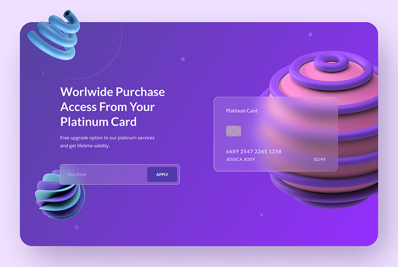
You may recall seeing this design on the good old Windows Vista or iOS 7 operating systems, but the frosted glass effect seems to have made a return, and we will most likely see more of it in 2021.
While neomorphic components have remained mostly decorative on Dribble for a variety of reasons, one of which being their inaccessibility, glassmorphic motifs are becoming more popular on the platform.
21. Familiar Icons
I believe we have all seen the significant changes that have occurred recently in the logos and symbols of well-known businesses.
People, on the other hand, are not pleased with it. Why? We should have regarded these logos as symbols instead of following the current fashion trend, such as flat geometric design or bright gradients since that’s exactly what everyone else believes them to be in their own countries.
22. Aesthetics in the Retro Style
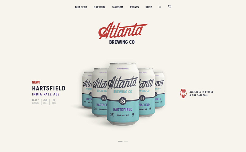
While Miley went back to the 1980s with asymmetry, large and strong lettering and a riot of colors, some of the user interfaces of 2021 will most likely be influenced by the 1990s as well. Other characteristics of the modernist art movement, such as constructivism or brutalism, will be incorporated into website design trends in the future.
We must keep in mind the goal of the website as well as the components to which we want to direct the visitors while designing the website. Choosing a user interface trend requires us to ensure that once visitors have enjoyed themselves on the website, they will also convert to a paying customers.
Conclusion
In this article, we talked about UI and UX design trends in 2021. In 2021 design trends will be a combination of minimalism, simple user interfaces, pastel hues, sophisticated typography, and immersive 3D graphics, among other things. If you want to succeed in developing a one-of-a-kind and engaging user interface, experiment with different inclinations we recommend a custom WordPress website design.
We are strong believers that the primary aim of UI/UX design is to assist people in achieving their objectives. When developing our solutions, whether they are multi-vendor car marketplaces or accommodation search websites, we highly recommend that you follow the latest trends.
Leave a Reply